interaction design for google cloud Design system platform
I was a UX Designer on the components team which means I partnered with other Cloud Platform Design team members (Visual Design, Standards & Cross Product Features) to cover the design of components in the Cloud Console aka Google Cloud Platform (GCP) so that Cloud feature teams can make consistent user experiences using our design system.

OVERVIEW

Google Cloud Platform (GCP), offered by Google, is a suite of cloud computing services.
I was part of a horizontal design system team that provides components for other designers to reuse with each of their verticals
Case study #1

Problem to solve
Google cloud platform users want to be kept posted about new features available their products
For example, some users have been requesting a “what’s new” section

Goals
Business — Meet user needs to make them less likely to switch to a competitor. Show our users that their feedback matter
Be consistent with Google Material
Relationship with users: Keep users posted about new features on GCP
UX #1: Provide a way for users to be kept posted about new features.
UX #2: Help users discover new products
UXR: Gather feedback and preferences of participants on the proposed feature discovery designs

My role and the team
I was one of the 6 UX designers on the design system team
Paired with a UXR
Horizontal team, no PM

Initial research
Our decision to add a feature promo component to the component library was motivated by:
Google Material team recommendation to have feature call out part of our growth kit and user education in general

Existing studies from Material Design
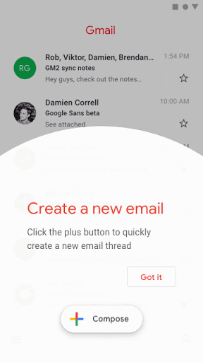
Tap target: most intrusive, 25% CTR
Dialog box: more likely to get ignored, 20% CTR
+16% more retained users
100% completion and positive feedback in user studies

Research
We ran a usability study with 3 different mock options through eight 1-hour sessions with qualified cloud users recruited through our ongoing experiments panel

Key finding #1
Tap target is the most noticeable but risk annoying users.
"I don't like when pop-ups cover my content. I'm most likely to block them or do something to make them not come up if they do that. ...It’s frustrating when it covers info”
Key finding #2
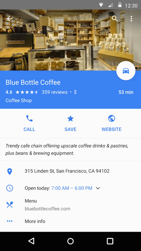
Big feature bubble received a mixed response.
Not very loud, yet noticeable and less disruptive than tap target. Creates a perception that user can only say yes, with no clear means to dismiss it. UI element and content seem redundant.

Key finding #3
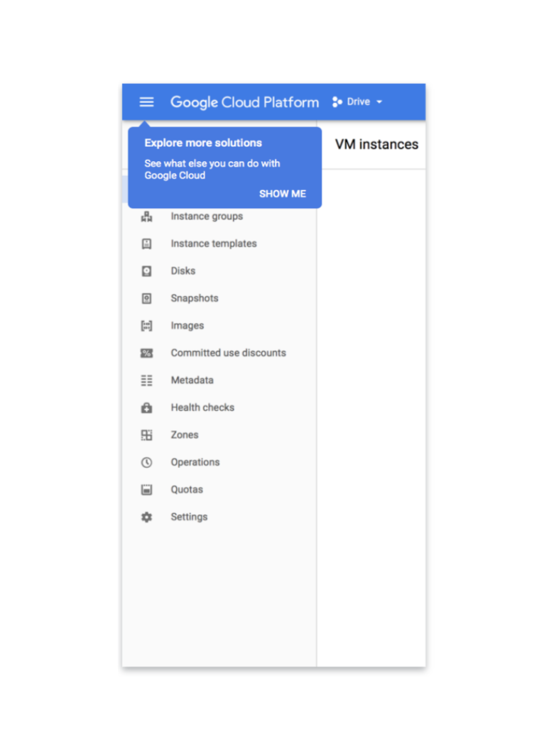
Small feature bubble was appreciated the most by participants, but is easy to ignore.

Conclusion
Have the 3 tiers of feature promos available in the component within the design system, but:
Follow GM recommendations depending on the type of users we’re talking to and on the product change the feature promo is related to
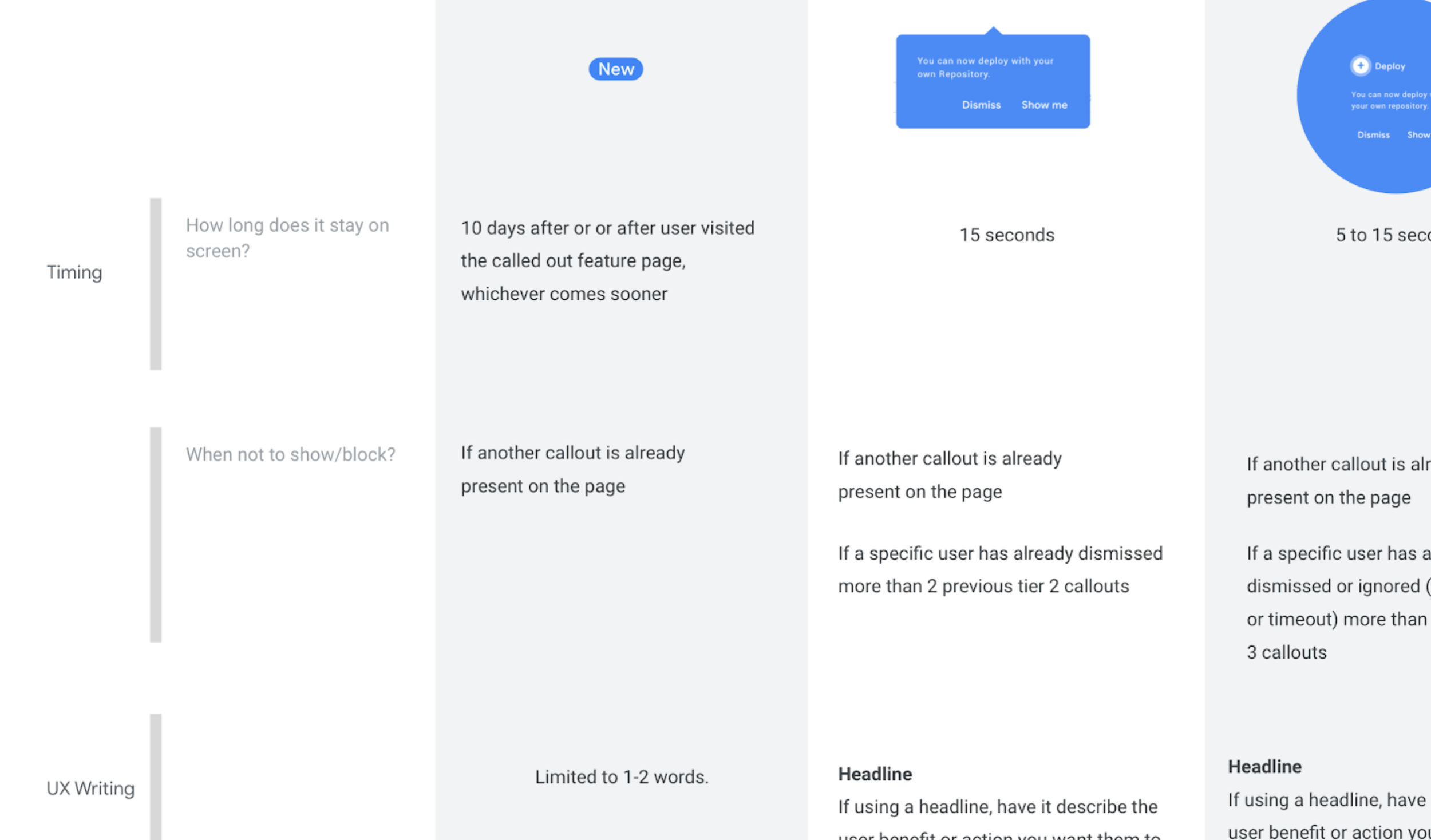
UX Writing & Timing
Have the 3 tiers of feature promos available in the component within the design system, but:
Follow GM recommendations depending on the type of users we’re talking to and on the product change the feature promo is related to

Key metrics, outcomes and lessons
We monitored two new features that had a feature promo associated to them to three other new features that didn’t have any and the first ones had 24% more views
The fact that we did not reuse exactly what GM had in their growth kit and adapted it to our B2B context...